
The purpose of this post is to ask for your help in choosing a book cover for the print edition of my recently published collection of poetry, “Lost In The Labyrinth Of My Mind”,
To this end I would appreciate it if you could please vote for your favourite cover (numbered on bottom left of each cover). It would assist me if you could add comments explaining your choice.
The following poem, “Lost”, provides a flavour of the poems to be found in the book and will, I hope aid you in choosing a book cover:
Lost
My thoughts lost on the damp air
Going who knows where.
The sodden grass
I pass.
Where children play
But not today.
No ball
Or bird call.
Only the rain’s incessant fall.
Many thanks for your help.
Kevin
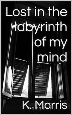
Current Cover
New Cover Alternatives


I like #11. It fits your title and the bright color grabs attention. At least it did mine.
Many thanks for voting in the poll Shirley and for your comment. Best wishes. Kevin
Reblogged this on Chris The Story Reading Ape's Blog and commented:
Blind Author Kevin needs YOUR HELP to select a new cover for his book – Please call over to his blog to see ALL the covers and participate in the poll at the bottom of the post 😀
Thank you for sharing Chris. Kevin
Welcome Kevin 🙂
I chose number 3 as it reflects the theme of the poems i think and also because its the one I would pick if in a bookstore.
Many thanks for your helpful comment and for choosing number 3. Best. Kevin
Reblogged this on firefly465.
Thank you for sharing. Best wishes. Kevin
Reblogged this on Smorgasbord – Variety is the spice of life and commented:
Kevin needs your help to select a new cover for the print version of his book Lost in the Labyrinth of my mind. Kevin is blind and is relying on us to select one that will not only reflect his poetry but also catch the eye of potential readers. There is an example of his poetry in the post.. Please head over and leave your opinion. thanks
Many thanks for sharing Sally. Best. Kevin
Ooooh, I like lots of these, but the one which stands out for me is #11. Your next problem will be that you will get so many diverse opinions, you still won’t know which one to choose, Kevin. I know whenever I put out book covers for opinions, I end up worse off than before, although with so many to choose from here, at least asking opinions should enable you to eliminate a few. Lots of luck, Kevin. And for me – number 11. I think that’s the one which ‘pops’. As somebody mentioned over on Chris’ blog (TSRA) it looks like the light at the end of the tunnel, too.
Many thanks for commenting and choosing number 11. Kevin
I voted for 11 but I would keep the fonts and colors of the current cover. The red is too harsh in my opinion.
Many thanks for your comment and choosing number 11. Kevin
I like 12…but think I would like to see it with white text rather than the red.
Many thanks for your comment and for choosing number 12 Sue. Best. Kevin
Good luck with it, Kevin!
Thank you Sue! Kevin
I mentioned on Chris’s blog that 11 pulls at you, maybe because of the light at the end of the tunnel.
Thank you for choosing number 11. Best wishes. Kevin
You are welcome.
That poem is so poignant. I like it 😊
Thank you Jacqueline, I’m delighted you like my poem “Lost”. Thank you also for your vote in the poll for my book cover. Best. Kevin
I voted for number 11 because the swirl draws you in. I prefer the warmer shade to it and think it is the most visually appealing of the covers.
Thank you for choosing number 11 Susan and your explanation for doing so. Best wishes. Kevin
Hi Kevin, number 11 had my vote due to the colored light that offers hope. The poem Lost is beautiful. 😄 Found you via Mr. Ape.
Many thanks for your comment Tracy and choosing number 11. I am delighted you like my poem “Lost”. Best wishes. Kevin
I voted for Number 4 (though Number 5 was a very close second). I think some of the other covers are a little too literal (i.e., the ones with the mazes). I think the closed window suggests that there is something more to discover (which brings in the labyrinth aspect). I like that it also hearkens back to the current cover, so there is no major disconnect between the two. Number 5 had a certain puzzle look to me, which again suggest labyrinth to my mind.
Many thanks for your comment Sarah and the explanation for your choice which I found interesting. Kind regards. Kevin
I seem to be in a small minority in preferring #5. After the dark and, in some cases, fairly expected options, this one stood out as different—lighter and provocative. Are these paving stones where we must watch which lines we step on (a sort of labyrinth, built on a mental construct, since it really doesn’t matter except in our minds if we step on a line)? Or are they scraps of paper, torn, of some mysterious architecture (of the mind?). This ambiguity, I think, adds to the appeal of the image.
I enjoyed this chance!
Thank you for your comment and the explanation for why you chose as you do. It certainly gives me pause for thought. Best wishes. Kevin
No. 7 has more atmosphere & the starkness of the image is enticing. I don’t like any with a red title. To me it cheapens the product. My opinion for what it’s worth 😊
Thank you for your comment and choosing number 7. Best wishes. Kevin
I dial the number 3. I like the white font and that is not quite as dark cover. The closed shutters I find very emblematic of the title of the book … if one is caught in his mind, he is for nothing from the outside receptive and remains as closed in his own world. Excuse my bad english, but I hope you understand what I mean.
The other cover with red font remind me too much of murder and manslaughter.
I wish you much success.
Many thanks for your comment and your vote Vera. I understand your meaning perfectly. Thank you also for following me at newauthoronline.com. Kind regards. Kevin
As someone with years of design experience, I have to agree with the comments on #3 as the most visually balanced and the colors balance as well (being b&w). In 11 the colors compete and the weight is entirely to the upper right of the cover. In addition the bold bright red of the titles screams to the buyer, which you really don’t want. You want to draw them into the book not shout at them. Titles should compliment the image not clash. This is why a poll may not be the best method for chosing a book cover.
Thank you for your comment Philip and for choosing number 3. Best regards. Kevin
I like number eleven, but without the red font. Outstanding.
Many thanks for your comment Tess and choosing number 11. Best wishes. Kevin
Anytime, Kevin. Always a pleasure to help. 😀
I voted for 18, it’s, for me anyway, the most eye-catching cover.
Many thanks for your comment and choosing number 18. Best regards. Kevin
Number 11 for me, too, but I’m not sure about the font. It doesn’t suggest poetry to me.
Many thanks for your comment and vote for number 11 Audrey. I note your comment about the font. Best wishes. Kevin
I’m going for 12 or 13. 11-14 are the only ones with real labyrinths and these two have the best blend of labyrinth and mind and lost.
Thank you for your comment and vote Jane. Best. Kevin