On 11 April, I published a post in which I asked for your assistance in choosing an image, for the book cover which will adorn my forthcoming collection of poetry, “My Old Clock I Wind and Other Poems”. Many thanks to everyone who took the time to comment on the photographs, your input is very much appreciated.
Having considered all your comments, I have decided to use the below image, which shows the clock in it’s entirety. Several of those who commented mentioned the glare in the original image, while others recommended that the title of my book be made more prominent.
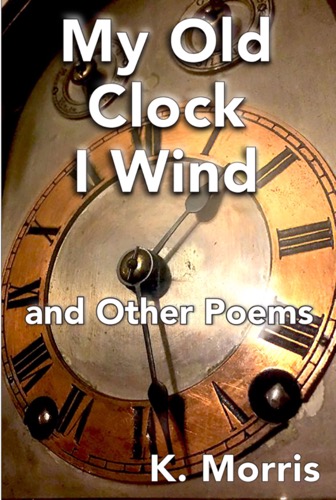
I would welcome your views regarding the reworked photograph. Has the glare been sufficiently dealt with? Does the title now stand out sufficiently? Once again, many thanks for your help.
Kevin

I like this version much better, but if it’s possible I’d try to remove the remaining glare behind the word “Poems”.
Thanks John. Your comment is useful. Best, Kevin
Isolating the glare and applying further filters would probably spoil the cover – recommend you leave it as is, Kevin
Thanks Chris. That is, I think very good advice. Virus-free. http://www.avast.com
Congratulations! This is a stunning cover.
Many thanks Annette. The cover shows my clock, which sits upon my bookcase, but the credit for the work on the cover goes to Moyhill Publishing. Kevin
I think this cover is lovely, Kevin. Well done to you (and Moyhill as well of course).
Thank you. All the very best. Kevin
Love it! 🙂 I do like John’s advice, but as someone else mentioned, you don’t want to spoil the overall look. I know next to nothing about editing an image myself. 🙂
Thank you, Brenda. All the best, Kevin
I think that the cover image is very strong. Yes there is a little glare behind the word “poems”, but the text is well outlined so it does not detract from the text.
I love the image of the old clock and the fact that it is in fact a photo if your actual clock and not taken from a stock library. I wonder whether you will mention this inside the book?
The composition is tight and centred on the clock face, making it ideal for use as a book cover, as any other details which could compete with the text have been cropped out.
Many thanks for your comment on the book cover, John. I really appreciate your input here. I hadnt planned to mention that the clock is mine. However you make an excellent point and I will consider doing so. All the best, Kevin
Actually, in the acknowledgments, which will appear at the back of the book, I do thank Shanelle Webb for taking the photograph of my clock. Thanks for the reminder though, its a good point.
I think it’s looking good. Yes, remove the rest of the glare if you can, but if not, it’s doable because it’s a nice photo. I still think the font isn’t right. Have you thought about a seriphed one? You are talking about winding back the clock, so maybe something a bit more classic might be appropriate.
Thanks Kate. I will give the font a little more thought. Being visually impaired (I have mobility vision which assists in getting around, with the help of my guide dog Trigger but not in reading print/seeing photographs), I am reliant on the advice of those who can see so your input and that of others is extremely helpful. Kind regards Kevin