As many of you are aware, I am in the process of publishing a further collection of poetry, “My Old Clock I Wind and Other Poems”.
The collection derives it’s title from the first poem, which is entitled (appropriately enough) “My Old Clock I Wind”.
I am in the midst of choosing a photograph for the book cover and would greatly appreciate your views on the photographs featured here, which show the clock from which the book derives it’s title.
Comments concerning the quality of the images, which picture you prefer and why (together with any other input) would be much appreciated.
Version 1: Clock Close-up
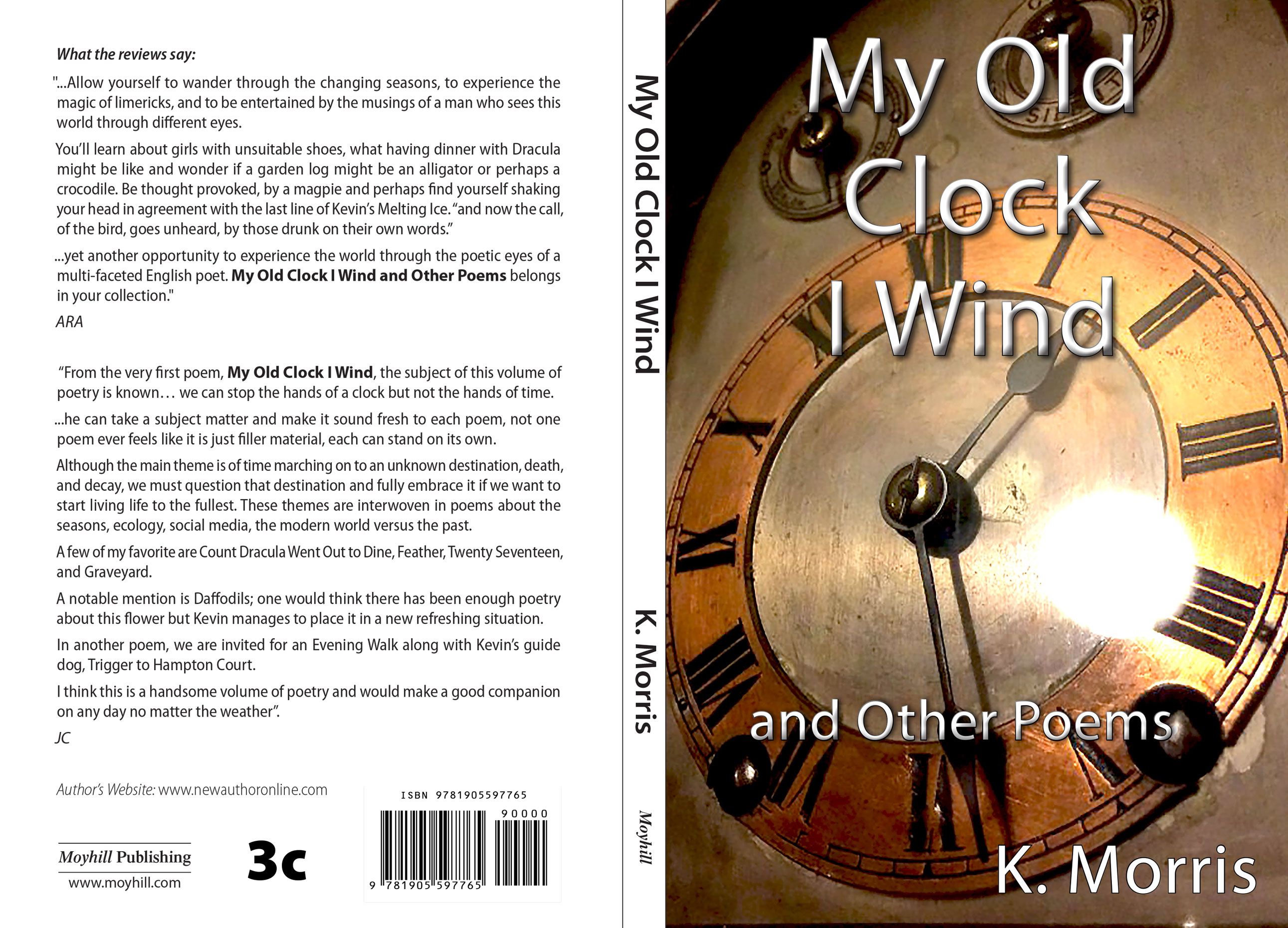
Version 2: Clock

Version 3: Clock and Picture


I like the first cover the best!
Many thanks Annette. Your feedback is really helpful. Best wishes, Kevin Virus-free. http://www.avast.com
I like the first one.
Many thanks. Your comment is very helpful. Best Virus-free. http://www.avast.com
Reblogged this on Chris The Story Reading Ape's Blog and commented:
Kevin needs your help to select the cover for his upcoming book – Please respond using the comments under his original blog post 😃
Thank you for the share Chris. Kevin
Welcome Kevin
Pingback: Let’s give Kevin Morris a hand here… He’s about to release a new book!Your assistance in choosing a book cover for “My Old Clock I Wind and Other Poems” would be much appreciated | Annette Rochelle Aben
I also prefer the first one. Good luck!
Thank you Olgan for the good wishes and your feedback on the photographs. Best, Kevin Virus-free. http://www.avast.com
Pingback: Let’s give Kevin Morris a hand here… He’s about to release a new book! Your assistance in choosing a book cover for “My Old Clock I Wind and Other Poems” would be much appreciated | Annette Rochelle Aben
My first choice is the second one.
I like the second one.
Many thanks for commenting and for choosing number 2. Kind regards, Kevin
I like version 1, but as a suggestion, take the shot straight on rather than at the angle.
Thank you for your choice of number 1 and your suggestion regarding the angle at which the photograph is taken. Kind regards, Kevin
First one most definitely, looks very dynamic!
Many thanks for commenting and choosing number 1 Kate. Best regards, Kevin
Reblogged this on Kate McClelland.
Thank you for sharing my post Kate. Much appreciated. Kevin
I like the first one and the angle. However, you need a whizzy photo friend to get rid of the glare from the camera shot. Photoshop experts can do it. I am not one so I am impressed when friends do it for me. Also, I don’t like the font for the title, the rest is fine. Plus, it is taking away from the image on both one and two. OK on three, but that is the flattest of the lot.
So in terms of layout, three works better, more striking (so to write), but the third, although dull, is a better composition.
Reduce the size of the image on one? Give space for the title (and change the font).
I agree with roughseas. The glare pretty much ruins #1 for me. I actually like #3 best even though it is a bit dull, because the title doesn’t obscure the clock.
Thank you Audrey, much appreciated. Kind regards, Kevin
Thank you for your thoughtful/detailed comments Kate, which are extremely useful. Kind regards, Kevin
Version 1 🙂
Many thanks for your choice of number 1 and sharing my post on Twitter, Tina. Kind regards, Kevin
I vote for the first one.
Many thanks for voting for the first photograph. Kind regards, Kevin
Version 1 Kevin 😉
Many thanks for your choice of number 1, Jack. Kind regards, Kevin
Funny… I like the first version too, Kevin!
Many thanks for commenting and your choice of number 1, John. Certainly the first photograph is ahead by a mile in terms of popularity as things currently stand! Kind regards, Kevin
Yep, the first!
Many thanks for commenting and choosing number 1, Glen. Kind regards, Kevin
Version one is the absolute best one!
Many thanks for choosing the first photograph, Mary. Kind regards, Kevin
Welcome! It was the best!
I like the first version best, it has an element of drama to it. My only suggestion would be that the font isn’t startling, I would probably choose something a little ‘heavier’ to make it a bit clearer but also give the cover some added gravitas. Well done, Kevin!
Many thanks for commenting on the photographs and choosing number 1, Lucy. Your view on the font is also very useful. Kind regards, Kevin
Hi, Kevin. The first version is by far the best, but try and make the title a little more bolder.
Many thanks for choosing number 1 and your suggestion as regards the title, Hugh. Kind regards, Kevin
I like the first one
Many thanks for commenting and choosing number 1, Zoe. Kind regards, Kevin
#1
Thanks Daria for choosing number 1. Number 1 certainly seems to be the winner by a mile! Best, Kevin
I like version 3 the best. 🙂
Many thanks for taking the time to comment and for choosing version 3. Kind regards, Kevin Virus-free. http://www.avast.com
It was my pleasure… I know, many of your followers and fans voted for version one… I’m kind of an exception.
There is nothing wrong with being an exception. All the best, Kevin Virus-free. http://www.avast.com